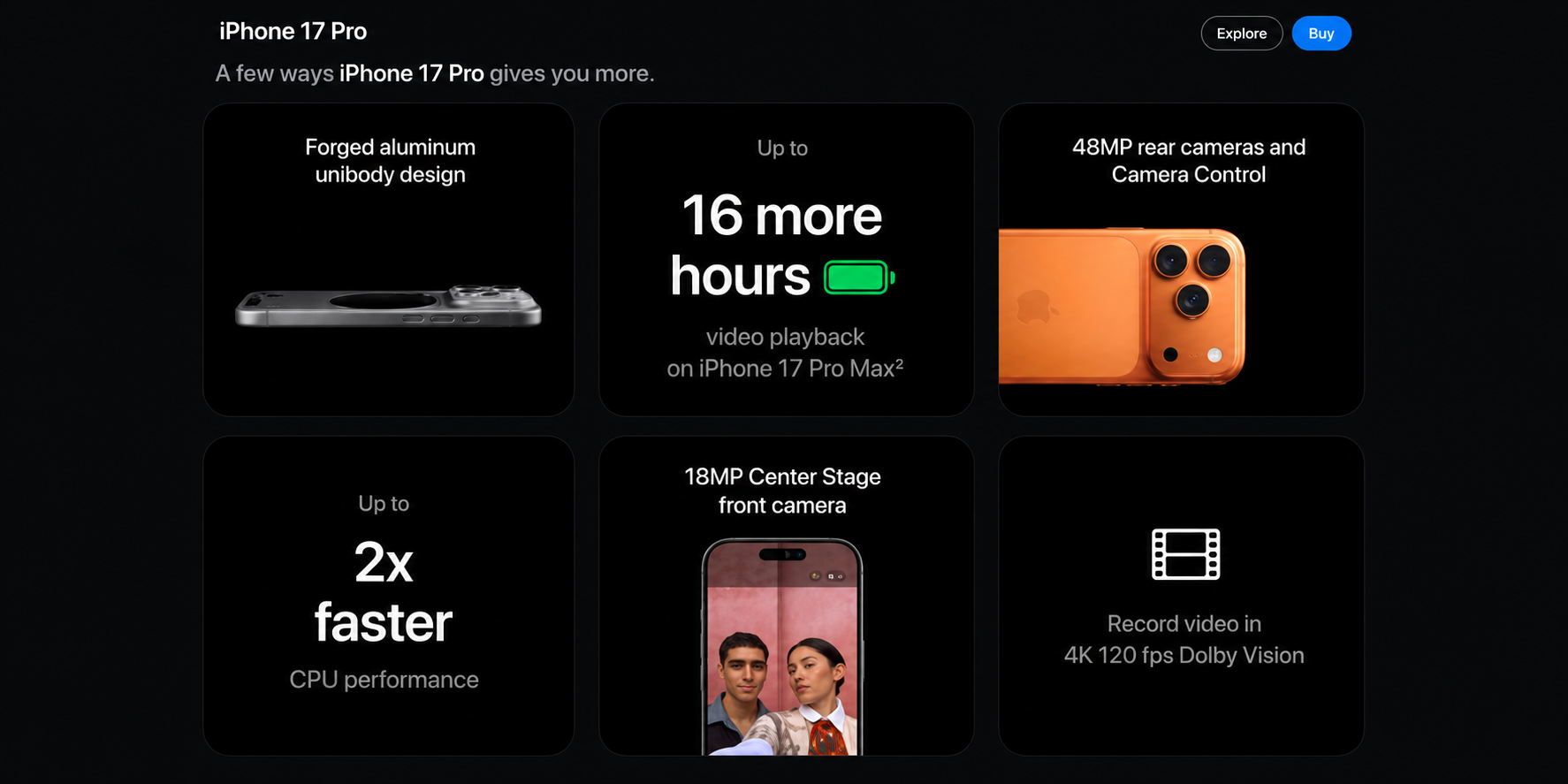


Every user, deep down, wants to run into something that feels unique a design that stops the endless scrolling and actually catches the eye. Lately, if you’ve been hanging out on Dribbble, Twitter, or landing pages for modern SaaS tools, you’ve probably noticed a trend taking over UI design: the Bento Box style.
What Is a Bento Box Layout?
Just like a Japanese lunchbox, a Bento layout uses a single container split into neat, distinct compartments.
Designers set up an underlying grid and mix variable block sizes within it. By combining micro-animations, bold typography, and contrasting card colors inside those blocks, boring feature lists suddenly turn into a visual playground.
Who Started the Trend?
Ask a few designers, and you’ll get two very different answers:
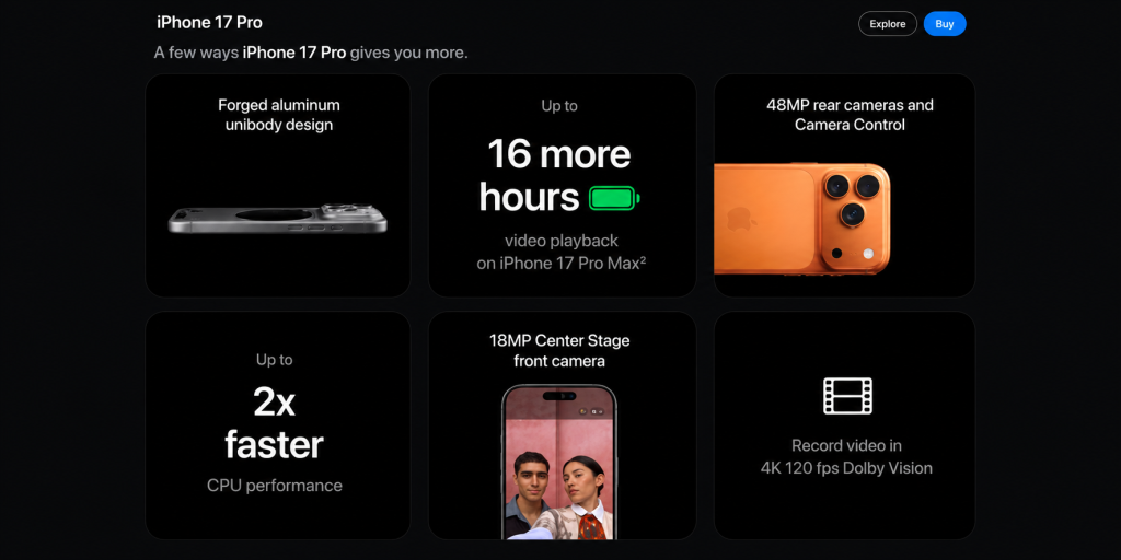
- The Popularizer (Apple): Most point to Apple’s Mac and iPhone promo videos. Instead of listing dull specs in bullet points, they show a high-impact, grid-based snapshot of features. You can see this live on the iPhone 14 Pro landing pages, where smart text hierarchy and subtle shading keep a dense grid from feeling cluttered.
- The Pioneer (Microsoft): Purists will remind you of Windows Phone 7. Microsoft’s Metro design language introduced dynamic “live tiles” arranged on a grid over a decade ago, setting the original blueprint for this look.
Why It Works
- Scannable: Users digest complex specs much faster in visual chunks.
- Engaging: Mixing video loops, icons, and text keeps the eye moving.
- Responsive: Grid-based modules naturally shrink down smoothly onto mobile screens.
Building Your Own
Achieving this look comes down to grid discipline: set up a clear column-and-gutter layout in your design tool, pick one or two “hero” blocks to draw primary focus, and keep your typography structured so the user knows where to look first.
Bento box design examples